Concept of Visual Identity
Atsuki Kikuchi
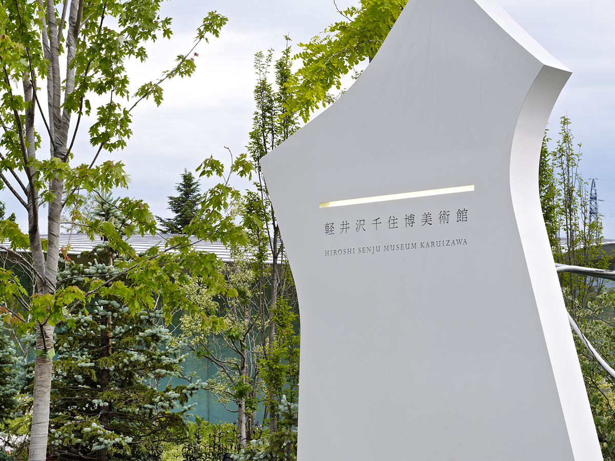
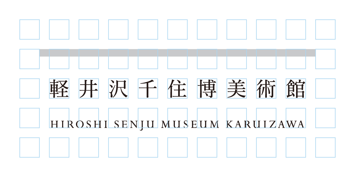
The museumʼs symbol mark is a simple single line stretching horizontally. There is no symbol color, allowing the emission of light and reflection to assume a symbolic role. My intention was to avoid being bound by fixed colors or forms in order to reveal how nature evolves over time and the seasons. In other words, I was inspired by the dazzling luminescence of works such as Waterfall and the tranquil surface of Flatwater. The symbol mark also serves to contrast with the organic form of the architecture, emphasizing the spaceʼs singularity. I proposed a design that would complement both the artwork and space, as well as function as part of the museum experience.

Atsuki Kikuchi
Art director. Born in Tokyo in 1974. He left the Department of Sculpture, the Musashino Art University before graduating. In 2000, he established a design company, “Bluemark”. In 2011, he closed the company and then established Atsuki Kikuchi Ltd. His main works include the Visual Identity (VI) Design for Aomori Museum of Art and Yokohama Triennale 2008, Poster/brochure works for Marugame Genichiro-Inokuma Museum of Contemporary Art and 21st Century Museum of Contemporary Art, Kanazawa, branding design for the fashion brand “minä perhonen” and “Sally Scott”, seasonal visual design for the brand of “ISSEI MIYAKE MEN”, and art direction for the magazine Shunʼga marugoto. His many awards include Japan Graphic Designer Association (JAGDA) New Designer Awards, Tokyo ADC Award, NY TDC Award, Incentive Award of Japan Sign Design Association (SDA) Award, and Silver Award of Japan Package Design Award (JPDA). He published a collection of works PLAY. He works as Visiting Professor at the Tohoku University of Art & Design.